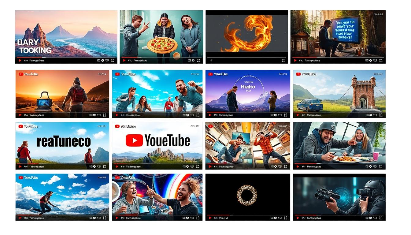
Grabbing viewers’ attention on YouTube is vital for video success. This guide explores creating faceless thumbnails that captivate and drive clicks. You’ll learn strategies for eye-catching designs without faces.
These techniques help your content stand out in a crowded market. They also boost your video’s performance and discoverability. We’ll dive into the art of crafting visually striking thumbnails.
Key Takeaways
- Understand the power of faceless thumbnails in capturing viewer attention
- Discover techniques for creating captivating, intriguing visuals that enhance video discoverability
- Explore the psychology behind successful faceless thumbnail design
- Learn strategies for incorporating branding elements and leveraging color psychology
- Master the fundamentals of thumbnail art, including composition and layout
The Power of Faceless Thumbnails
Faceless YouTube thumbnail designs grab viewers’ attention and boost engagement. They use eye-catching visuals without faces to spark curiosity. This approach encourages viewers to click on your content.
Captivating Viewers with Intriguing Visuals
A thumbnail without a face creates mystery and intrigue. It makes viewers wonder about your video’s content. This unique approach helps your content stand out in search results.
Faceless thumbnails increase the chances of getting views and engagement. They make your videos more clickable on the YouTube homepage.
Enhancing Video Discoverability
A faceless thumbnail design strategy can boost your video’s discoverability. Craft engaging graphics that capture your content’s essence. This improves your video’s visibility and reach.
Effective thumbnails drive more viewer engagement and channel growth. They help your content stand out in a crowded platform.
“The right thumbnail can make all the difference in capturing a viewer’s attention and driving them to click on your video.”
Dynamic visuals in faceless thumbnails can transform your video marketing. They enhance your video’s visibility and appeal. Intriguing imagery increases the chances of viewers clicking on your content.
Exploring the Psychology Behind Faceless Designs
Faceless YouTube video thumbnail designs can captivate viewers and boost engagement. They trigger curiosity and intrigue, leading to more clicks. The absence of faces shifts focus to other elements like colors, shapes, and text.
Our brains are wired to be drawn towards faces for social cues. Without faces, viewers’ attention is redirected to other visual aspects. This creates mystery and anticipation, encouraging clicks on video thumbnails.
Faceless designs allow viewers to project their own interpretations onto the content. This fosters a more personal connection with the thumbnail. It taps into the viewer’s imagination and emotions, creating a memorable experience.
| Psychological Factor | Impact on Viewer Engagement |
|---|---|
| Curiosity and Intrigue | The absence of a face can spark the viewer’s curiosity, encouraging them to click on the thumbnail to learn more about the content. |
| Personalization | Faceless designs allow viewers to project their own interpretations and emotions onto the thumbnail, creating a more individualized connection. |
| Emotional Response | The lack of a face can evoke strong emotional responses, as the viewer is forced to focus on other visual elements and their own subjective experiences. |
Content creators can use faceless YouTube video thumbnail designs to craft attention-grabbing visuals. These designs captivate viewer engagement and drive increased viewership. Understanding these psychological factors helps create more effective thumbnails.

Faceless YouTube Video Thumbnail Design: Strategies for Success
Captivating faceless YouTube thumbnails can make your video stand out. To succeed, blend your brand’s visual identity with color psychology. This approach can significantly boost your video’s performance.
Incorporating Branding Elements
Your thumbnail should reflect your brand’s identity. Include key visual elements like your logo, typography, and color palette. This creates a cohesive look that viewers will recognize.
A consistent aesthetic helps build a strong brand identity. Your audience will easily associate this look with your content.
Leveraging Color Psychology
Colors can evoke specific emotions and grab attention. Consider the psychological impact of different hues when designing your thumbnail. Vibrant colors like red or orange create excitement and urgency.
Cool tones such as blue or green convey calmness and trustworthiness. Choose colors that align with your brand and message.
Combine your brand’s visual style with color psychology principles. This strategy will help you create thumbnails that captivate viewers. The result? Increased engagement and viewership for your videos.
Thumbnail Art: Mastering the Fundamentals
Thumbnail art is vital for video marketing success. It’s the first thing viewers see of your content. A well-crafted thumbnail can entice viewers to click and engage.
Understanding composition and layout is key to mastering thumbnail art. These principles help create balanced and visually striking designs.
Understanding Composition and Layout
Effective thumbnail design relies on balanced composition. Use negative space to guide the eye to focal points. This creates intrigue and attention-grabbing visuals.
Typography is crucial in thumbnail art. Choose readable fonts that complement your design. Place text elements carefully to blend with engaging graphics and enhance the message.
Balance and symmetry are important in thumbnail composition. Asymmetrical layouts can be effective with proper visual weight. Consider element placement and size for a cohesive thumbnail art.
“The key to creating successful thumbnail art is to strike a balance between simplicity and visual intrigue. Refine your design until it captivates the viewer and compels them to click through to your content.”
Master composition and layout to boost your video marketing. This will help your thumbnail art stand out in the digital world.
Attention-Grabbing Visuals: Techniques to Captivate Viewers
Video promotion thrives on captivating visuals. Dynamic graphics can create YouTube thumbnails that pique viewer curiosity. These visuals drive engagement and encourage clicks to your content.
Bold, contrasting colors draw the eye instantly. Vibrant hues make thumbnails stand out in crowded feeds. Pair these colors with clean shapes for an arresting design.
Typography also plays a crucial role. Experiment with bold fonts that match your brand. Choose the right typeface and size to make your message readable and impactful.
Relevant icons or graphics provide context about your video’s content. These visual cues intrigue viewers and encourage them to explore further.
| Technique | Example | Impact |
|---|---|---|
| Bold, Contrasting Colors | Instantly draw the viewer’s attention and create a visually striking thumbnail. | |
| Striking Geometric Shapes |  |
Elevate the visual interest and communicate a sense of dynamism. |
| Attention-Grabbing Typography | Ensure your video title or key messaging is easily readable and impactful. |
Mastering attention-grabbing visuals elevates your YouTube thumbnails. Bold colors, striking shapes, and eye-catching graphics make your content stand out. These techniques help you thrive in the competitive digital landscape.
Video Marketing: The Importance of Clickable Thumbnails
Clickable thumbnails are vital in video marketing. They’re the first thing viewers see, drawing them to your content. Faceless thumbnails can boost your videos’ appeal and increase audience interaction.
Driving Traffic and Engagement
Well-designed thumbnails are key to successful video marketing. They can significantly increase your video’s click-through rate and viewership. Your thumbnail must stand out to grab attention in a sea of content.
It should pique curiosity and compel viewers to click. This way, they’ll discover your video’s message and engage with your content.
- Optimize your thumbnails to maximize discoverability and visibility on platforms like YouTube.
- Leverage the power of faceless designs to capture the viewer’s attention and encourage them to engage with your content.
- Incorporate branding elements and strategic use of color to create a cohesive and recognizable visual identity for your video marketing campaigns.
Master the art of clickable thumbnails to drive traffic to your videos. Use visually captivating faceless designs to boost your marketing strategy. This approach can amplify your reach in the crowded digital landscape.

“Crafting compelling thumbnails is the key to unlocking the full potential of your video marketing efforts. It’s the first impression that can make or break your video’s success.”
| Metric | Baseline | Optimized Thumbnail | Improvement |
|---|---|---|---|
| Click-Through Rate | 8% | 15% | 87.5% |
| Views | 1,200 | 2,800 | 133% |
| Engagement (Likes, Comments, Shares) | 150 | 420 | 180% |
This data shows how optimized thumbnails boost video marketing performance. Investing in visually appealing faceless thumbnails can increase traffic and engagement. It can also improve your overall video marketing strategy.
Engaging Graphics: Creating Dynamic Visuals
YouTube thrives on captivating visuals. Engaging graphics are key to promoting videos and building a strong visual identity. With the right imagery and icons, you’ll grab attention in the ever-changing digital world.
Incorporating Relevant Imagery and Icons
Creating engaging graphics for YouTube thumbnails is an art. It’s about balancing eye-catching visuals with thematic relevance. Well-chosen dynamic visuals instantly convey your content’s essence, sparking viewer curiosity.
In thumbnail art, strategic imagery and icons boost video promotion. Aligning these elements with your brand creates a compelling representation of your content. This approach resonates with your target audience effectively.
| Visual Element | Purpose | Effective Example |
|---|---|---|
| Relevant Imagery | Captures the essence of your video content | |
| Recognizable Icons | Reinforces your brand identity and video theme |  |
Strategic visual elements create engaging graphics that captivate viewers. They drive people to explore your content further. Master dynamic visuals and thumbnail art to unlock your YouTube channel’s full potential.
Vlog Branding: Establishing a Consistent Aesthetic
Vloggers need consistent YouTube thumbnails to build a recognizable brand identity. Effective strategies can help develop a cohesive visual language. This approach reflects personal style and connects with your audience.
Developing a Recognizable Visual Identity
Creating a signature look sets your content apart. It reinforces your brand’s identity across all video thumbnails. Every design element should work together to create a compelling aesthetic.
Incorporate your brand’s color palette in thumbnails. Use distinctive graphic elements to make your content stand out. These techniques will help viewers instantly recognize your vlog.
Master the art of engaging graphics and thumbnail art. This skill can captivate viewers and boost your vlog’s discoverability. Leverage vlog branding, branding, thumbnail art, and engaging graphics to stand out.
Establish a strong, consistent visual presence for your brand. This approach will help you thrive in the ever-changing world of video content.

